

Well, if that's not the most complicated name for a palette I don't know what is. I got this palette as a Christmas present from my sister who knows how much of a beauty junkie I am. So, obviously I had to make a review on this very interesting palette.


Let's start off with the packaging. At first glance, it looks like a cute chubby notebook. I love the design on the front and back. It also has a rubber band closure to ensure this little book keeps in place. Compared to other palettes, this is very thick.

Opened up to the "first page" of this notebook, you get a little card with a description of the artist who designed the palette covers.

The second and third page are the actual shadows, blushes, and soft lights highlighters. This palette contains 32 photo op eyeshadows, 6 blushes, and 2 soft lights highlighters. The palette is also split up by family colour as well as warm shades and cool tones on each side of the palette. In the end, the palette is split up into 8 eyeshadow quads.

The acrylic covers lift off to reveal the shadows and the face products. I love the idea of this because the names of each product are listed on the covers. However, I feel it could've been implemented better where the packaging would take up less space

On the final page of this booklet, there are 4 cards of eye looks that can be created using each colour family quad. I enjoy little cards like these because as someone who doesn't like to stray away from natural colours, it's a great start and it initiates me to play around with this palette more by trying out the looks found on these cards.
 |
| All 8 looks included |
Alright let's move onto the blushes and highlighters.

Posy Pink is a bright vibrant pink shade. It's the kind of shade you can catch Barbie wearing.

Sunset is a warm golden shade, perfect for warming up any look.

Persimmon is a bright neon coral colour. I can't wait to play with this one more in the summer time.

Glow is a beautiful yellow toned highlight shade. It's become on of my favourites,
 |
| Left to Right: Posy Pink, Sunset, Persimmon, Glow |

Bitten is a beautiful berry coloured blush, perfect for this time of year. It came up more pink in the closeup, but you'll see in the swatch how deep it is.

Prism is the babiest of pinks out there. I would most likely use this as a highlight more than a blush, or maybe just as an eyeshadow.

Plum is another deeper colour that's perfect for the season. It's definitely not a plum colour but more a brick red.

Finally Shimmer is a peach toned highlight.
 |
| Left to Right: Bitten, Prism, Plum, Shimmer |
Each of the blushes and highlights swatched so beautifully, I can't wait to start trying these out. Now, let's move onto the eyeshadows.
 |
| Top to Bottom; Naked, Charmed, Candy, Framboise |
The first column of eyeshadows are "pinks".
 |
| Left to Right: Framboise, Candy, Charmed, Naked |
As you can see from the swatches, Framboise and Candy are very pigmented. They are very soft to the touch. Naked is a bit on the chalky side. Charmed is a colour I have a love-hate relationship with. It has a very different texture as it is a light pink colour with flakes in it. Yes. Actual flakes. Not glitter, not shimmer, but flakes. It's something completely different than any of the other colours in this palette, as well as anything that I've ever owned. I'm not sure how I will be able to use this but, it is a very pretty shade. Alright, next column.
 |
| Top to Bottom: Java, Oxidize, Nutmeg, Alabaster |
This column is called the "reds and browns".
 |
| Left to Right: Alabaster, Nutmeg, Oxidize, Java |
This row is one of my favourites, based on the two middle swatches. The more metallic shades in this palette are the most pigmented and the most beautiful. Alabaster is again on the chalky side of things, a trend that can be seen with the lighter matte shades. Nutmeg and Oxidize are just amazing, they look like foiled shadows or wet shadows. Java is a cool toned dark matte brown, a pretty standard colour for a palette.
 |
| Top to Bottom: Custard, Torch, Goldenrod, Gold |
The third column is called the "yellows and oranges"
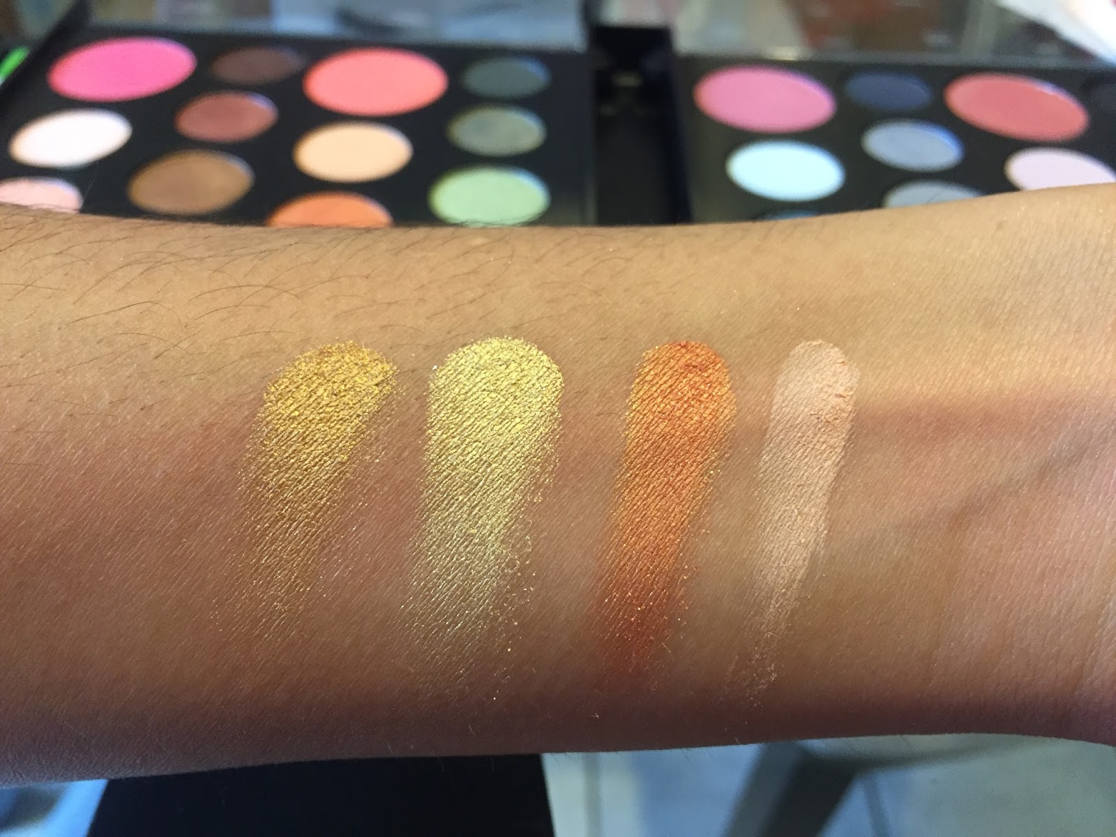 |
| Left to Right: Gold, Goldenrod, Torch, Custard |
I wasn't entirely wowed by this column. Gold, which looked like it would be a metallic like Nutmeg or Oxidize lacked in pigmentation. Custard is a nice highlight shade for the browbone and is one of the more pigmented lighter matte shades. Torch has to be the star of this column. Its such an unusual colour; a warm orange with gold shimmers throughout. Goldenrod is a very yellow gold shade that has the same texture as Gold. If Gold and Goldenrod were wet I think they would make amazing shades.
 |
| Top to Bottom: Gypsy, Spruce, Zoom, Sea |
The fourth column and by far my favourite is called the "greens".
 |
| Left to Right: Sea, Zoom, Spruce, Gypsy |
Like I said, this is my favourite column. All of the colours swatched were amazing. Sea is a duochrome shade that look mint green in the pan but had green shimmers throughout. I would've liked it to be more pigmented however. Zoom is a shimmery light green while Spruce has the same metallic texture as Nutmeg and Oxidize. Gypsy is a beautiful smokey olive shade. I'm very excited to use this column.
 |
| Top to Bottom: Sky, Nile, Azure, Pacific |
The next column is called the "blues".
 |
| Left to Right: Sky, Nile, Azure, Pacific |
For swatching blues without any base underneath, I was pleasantly surprised with the pigmentation of these colours. Sky is the babiest of blues, again on the chalky side. Sky is a beautiful blue with silver and blue shimmers throughout. azure is a matte deep blue while Pacific is a deep shimmery teal shade.
 |
| Top to Bottom: Harbor, Steel, Cement, Cosmic |
This column is called the "indigos and greys".
 |
| Left to Right: Harbor, Steel, Cement, Cosmic |
This was another good column and it has a lot of potential for looks. Harbor in the pan is a deep navy blue however it came out more as a dark grey shade. Steel is a bluish grey shimmery colour, most definitely true to its name. Cement is a matte grey shade, I'm really happy with the pigmentation of this shade. Cosmic is another duochrome colour, with blue shimmers all throughout. It didn't quite show up in this picture however. Cosmic is also very chalky, there is a lot of fallout while I was swatching this shade, a sticky base will be needed when applying to the eyes.
 |
| Top to Bottom: Breeze, Celestial, Eggplant, Orchid |
The second last column is called the "violets".
 |
| Left to Right: Breeze, Celestial, Eggplant, Orchid |
Breeze is pale lilac colour, I was very surprised with the pigmentation on it considering it was a light matte shade. Celestial is like the better version of Charmed. However having a lot of fallout, it still has more hold to it than Charmed. It's a shimmery warmed toned lilac shade. Eggplant is a smokey plum shade and Orchid could definitely use some work, but hey, that's what eye shadow primers for!
 |
| Top to Bottom: Ebony, Smoke, Silver Moon, Snow |
The last column is called "black and white".
 |
| Left to Right: Ebony, Smoke, Silver Moon, Snow |
The last row is clearly made for a classic smokey eye. Ebony is a matte black with surprising pigmentation for a matte. Smoke is a dark matte grey, again very surprised with the pigmentation on this dark matte grey. Silver Moon is a metallic silver, however I would've liked it to be more pigmented like Oxidize (if I keep comparing shades to Oxidize, I might give away that it's my favourite). Snow is a matte white, and again very surprised by its pigmentation being a matte colour.
I decided to make some gifs of my favourite shades in the palette. I like to call it "shadows in motion". This one here is the duochrome shade "Sea". Isn't it so beautiful?
This next one are of my favourite three metallic shades. They look like foiled shadows, I love how the glitters dance in the light. The shades from top to bottom are Nutmeg, Spruce, and Oxidize.
My overall thoughts on this palette is that even though there are some beautiful shades like the metallics, I'm not overly impressed by it. The packaging is very bulky and I don't think I would ever travel with it. Most of the shadows are very soft and theres a lot of fallout, I can't imagine what would happen if I put a brush to these pans. The blushes are near all of the darker shades so I'm worried that some fallout from the dark shadows will end up in the blushes and compromise them. I'm very happy that this was a gift, but I don't think I would purchase this.
If you have this palette, what are your thoughts on it?

No comments:
Post a Comment